UI Changes are Coming to X: Previews New Changes
X (formerly Twitter) has changed a lot ever since Elon Musk took over the company. Most of the changes have been in the policies and new features. There has not been a UI change for a long time.
Now, whether you like it or not, the company is about to take a significant step to drastically change the way we interact with posts on X.
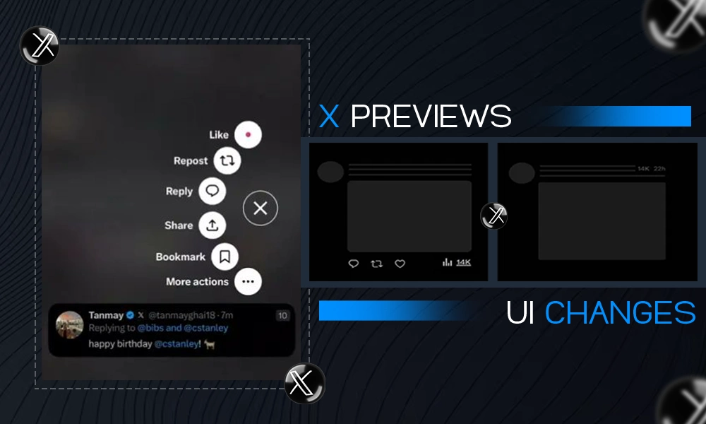
Now, the company is looking to implement a major UI update that will remove all response buttons from the main view, and hide them behind action-based ques.
Elon Musk confirmed this change last month through his vision for the app, which will see the comment, like, or repost buttons to be removed from the view.

Now, a preview of new UI changes of how users are going to be interacting with the posts is live. Check out this tweet from Christopher Stanly and see how you can interact with the new system.
With this, users need to tap and hold on a post to bring up the hidden action buttons to interact with it via all the usual options.
All the options will be available but through gesture control and not through visible buttons.
At first, this change may seem unnecessary for most users but Elon Musk says that it will make the feed cleaner.
But I don’t know whether people will like it or not. It may reduce overall engagement in the app because users won’t have the option to engage right before their eyes. There would be a learning curve for most users to adjust to the new options.
So, initially, the engagement would be reduced. However, once we are used to it, the overall engagement on the app will pick up.

